LORE
With outdated and scattered branding, SimpleTexting was in need of a brand refresh and a solidification of their visual voice as a whole.
With outdated and scattered branding, SimpleTexting was in need of a brand refresh and a solidification of their visual voice as a whole.
INGREDIENTS
branding | ad designs | illustration | web design | motion design
branding | ad designs | illustration | web design | motion design
Branding
Establishing and building upon a visual language on the website and social media.
Establishing and building upon a visual language on the website and social media.
ICONS
SOCIAL MEDIA BANNERS
COVERS FOR "HOW-TO" DEMO VIDEOS

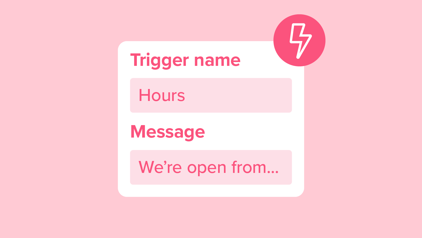
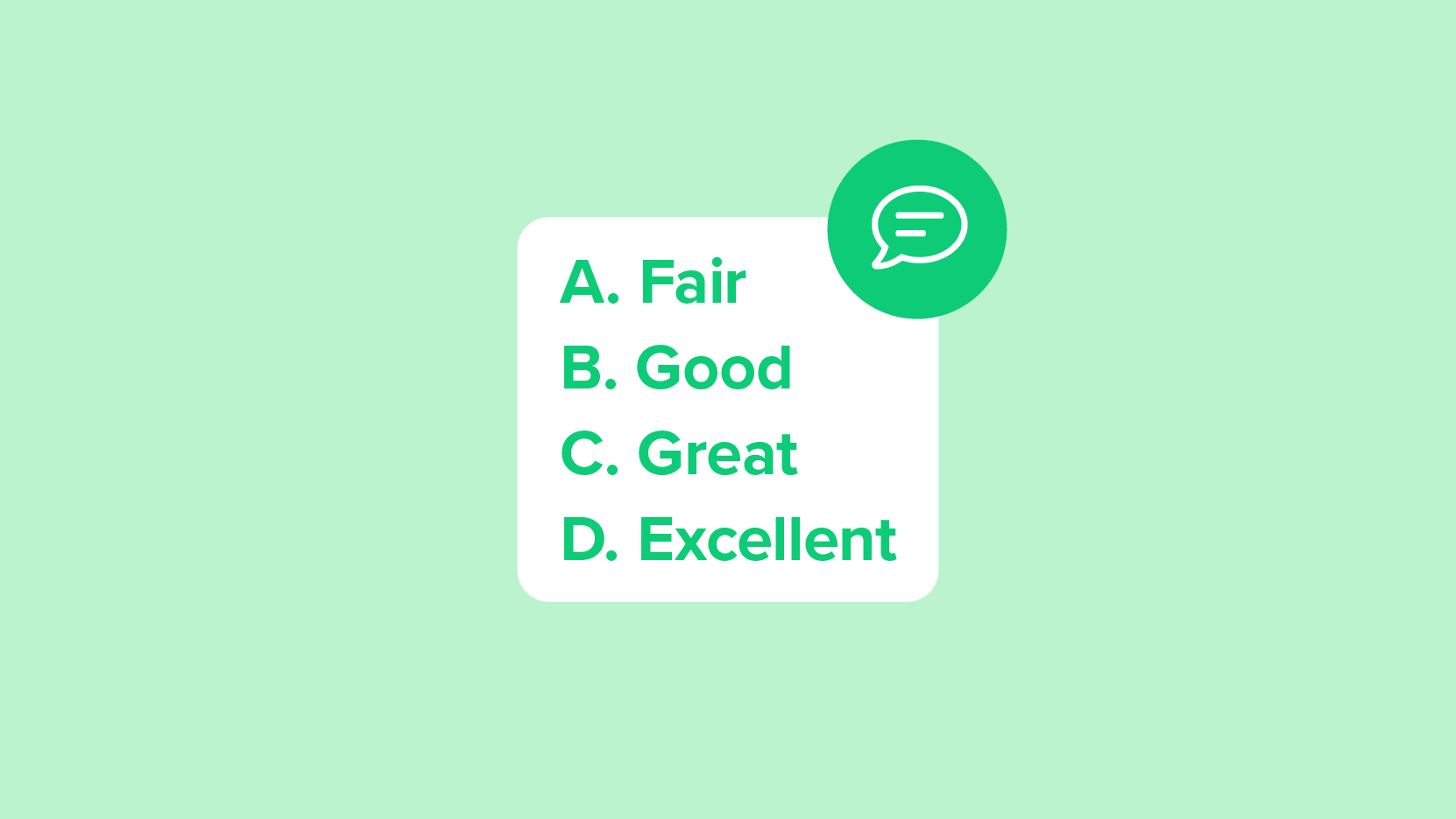
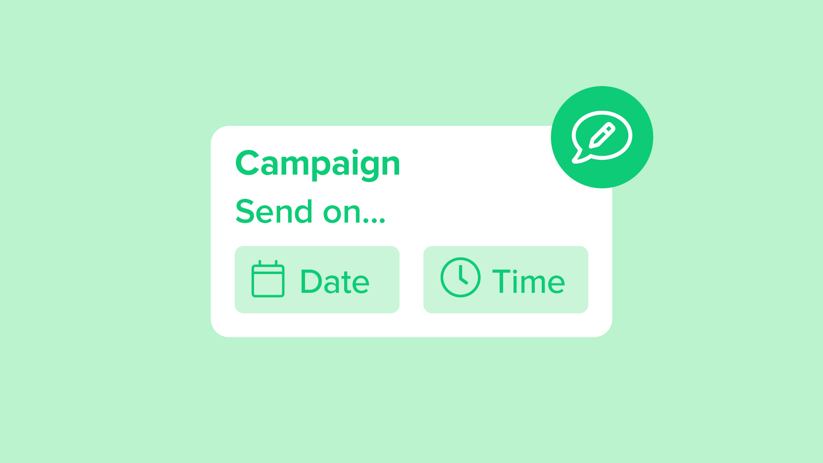

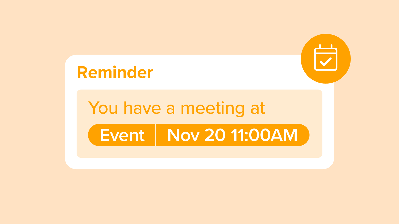

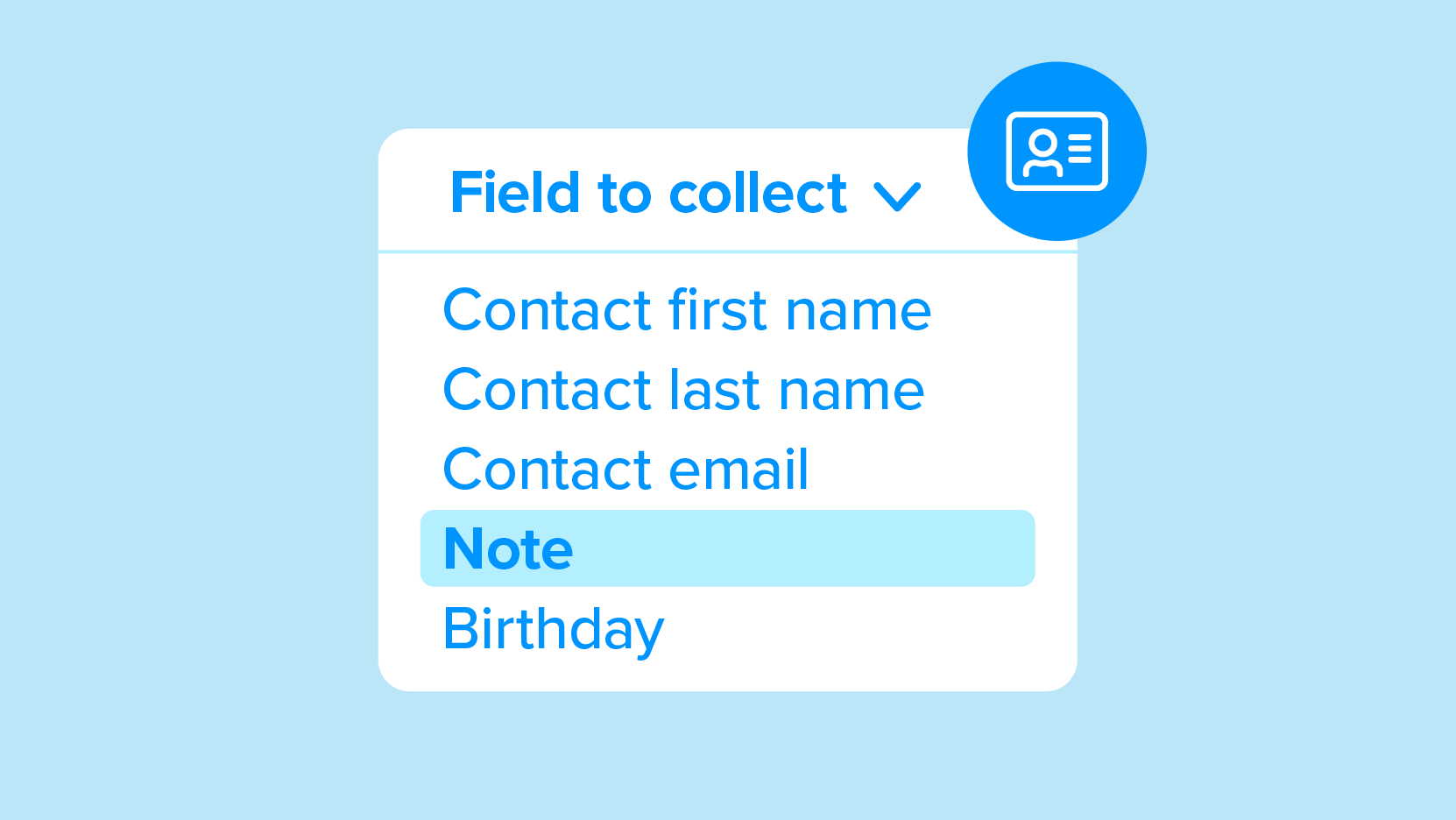
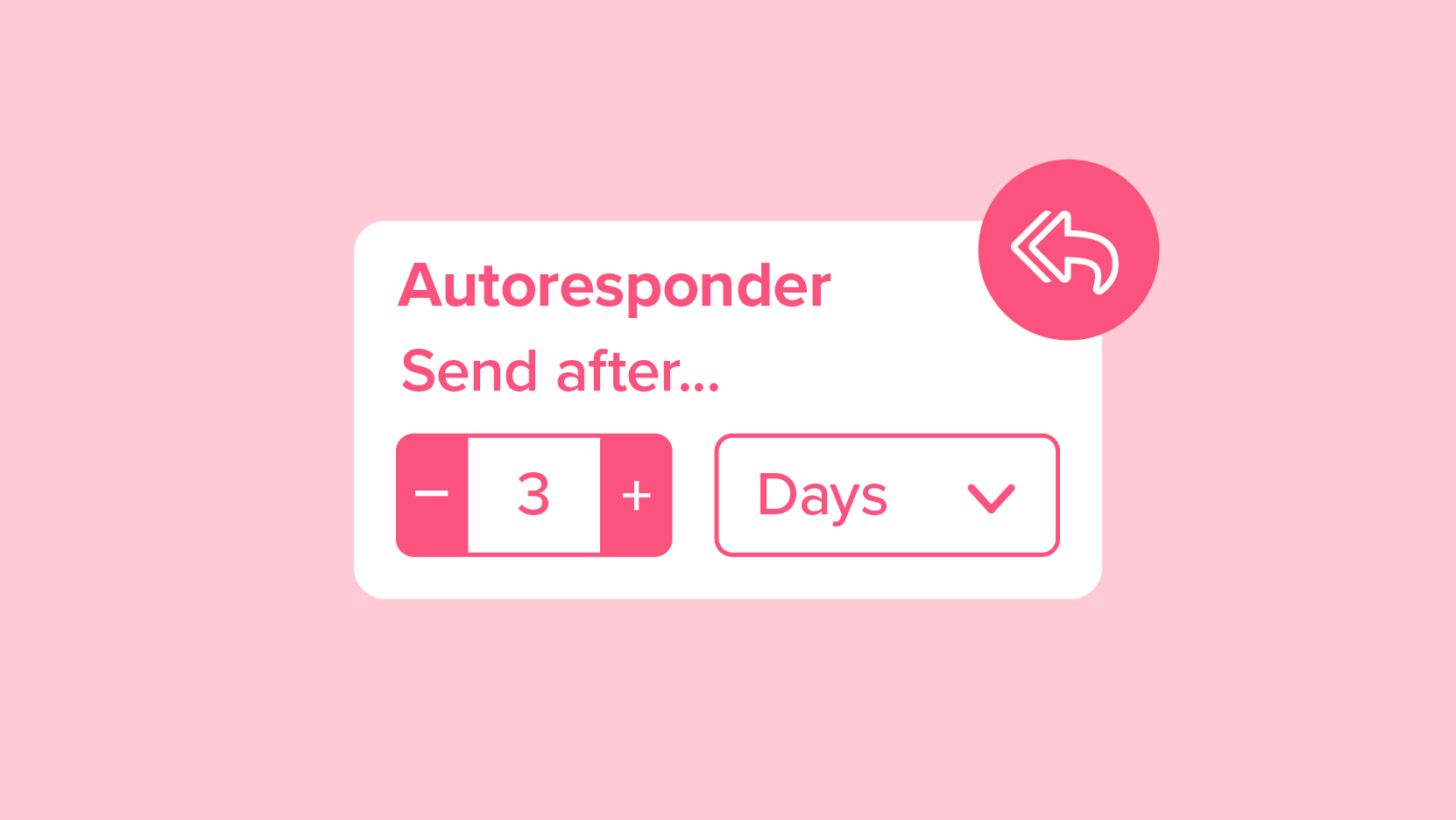
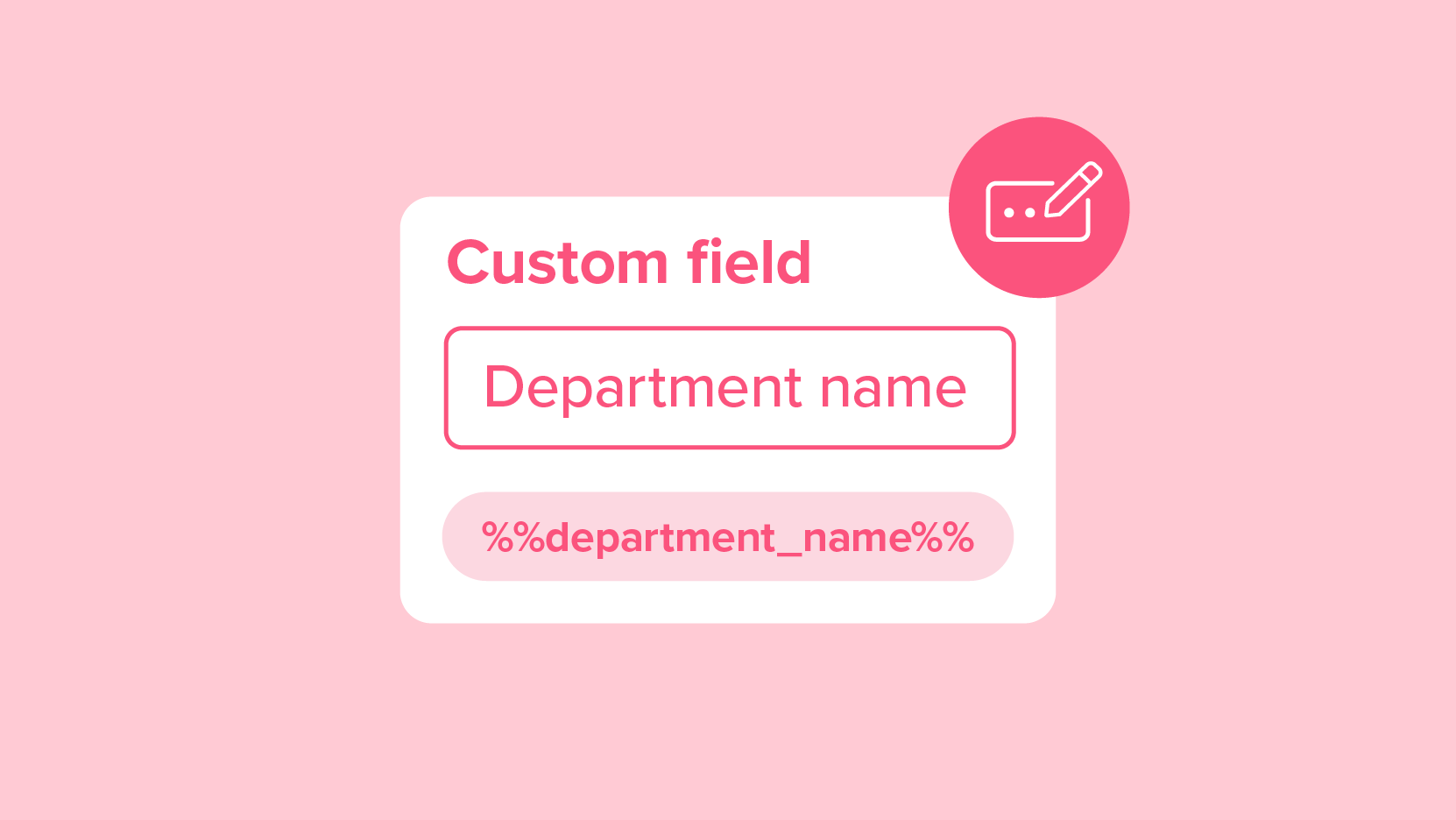

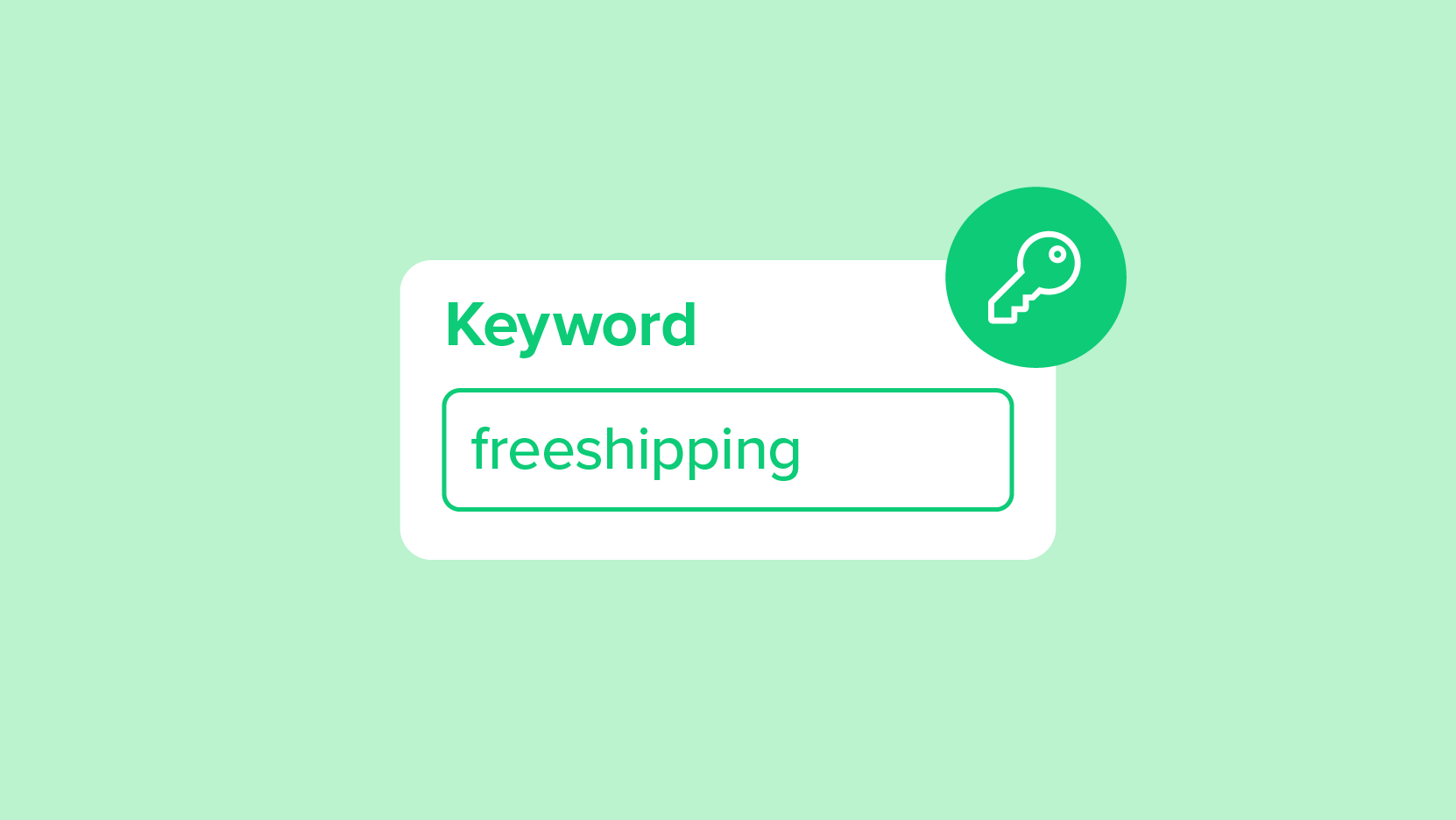
Illustration
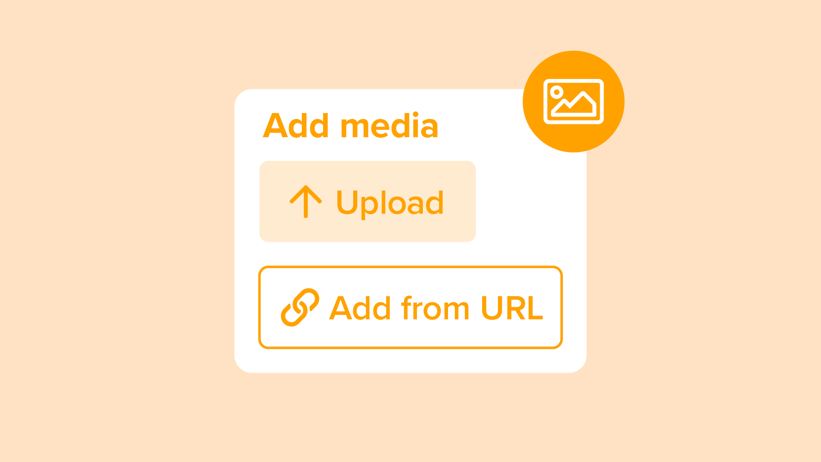
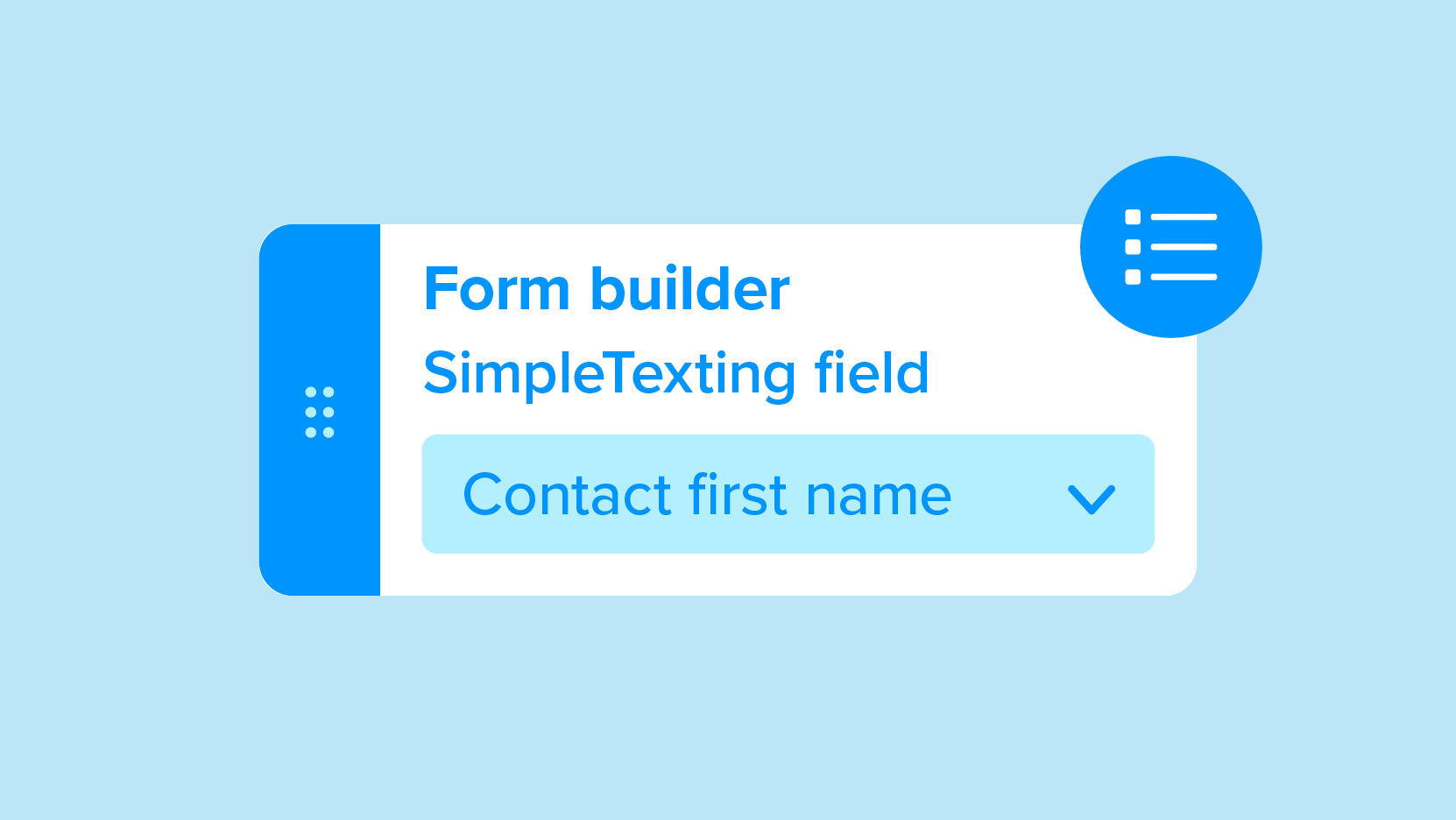
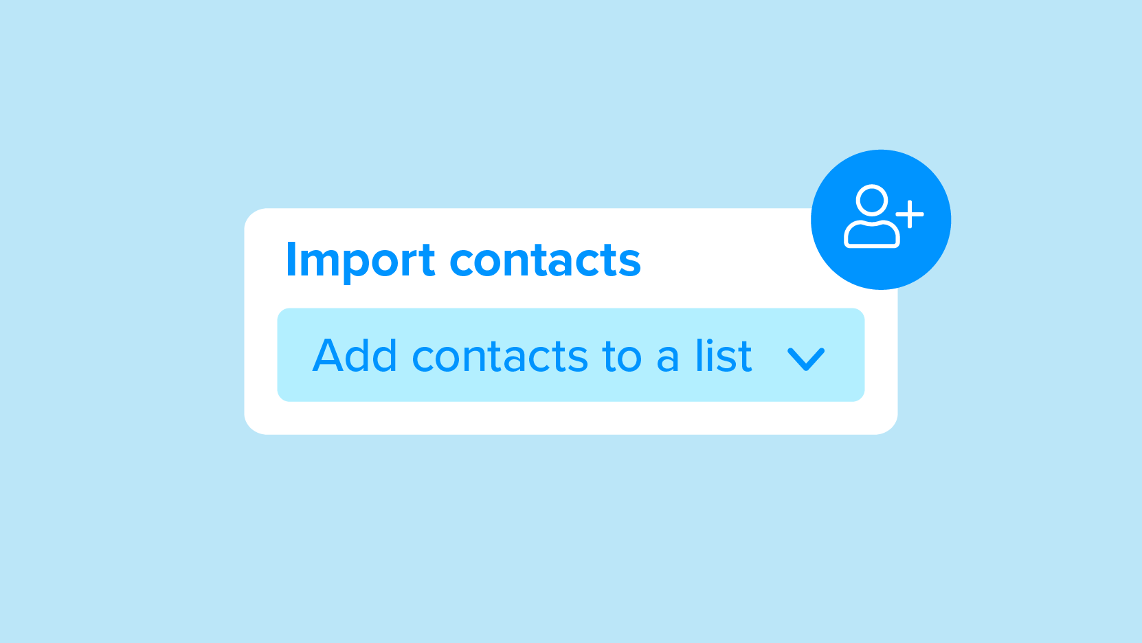
Establishing an illustration style for the website's blog and social media posts
Establishing an illustration style for the website's blog and social media posts


Ads
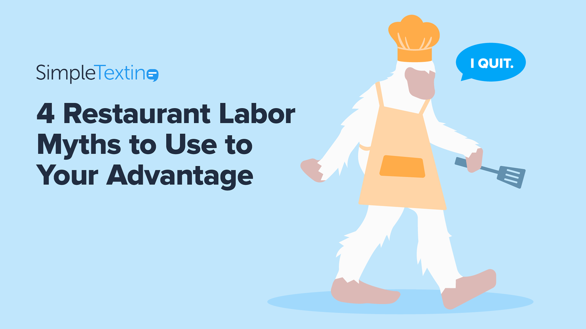
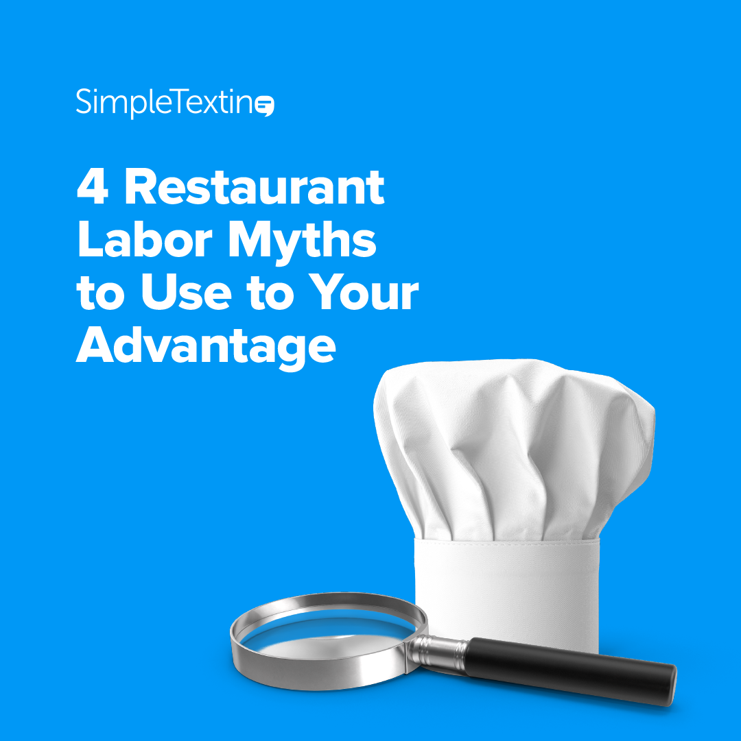
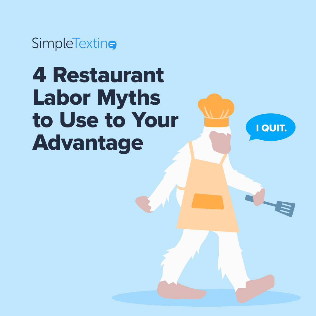
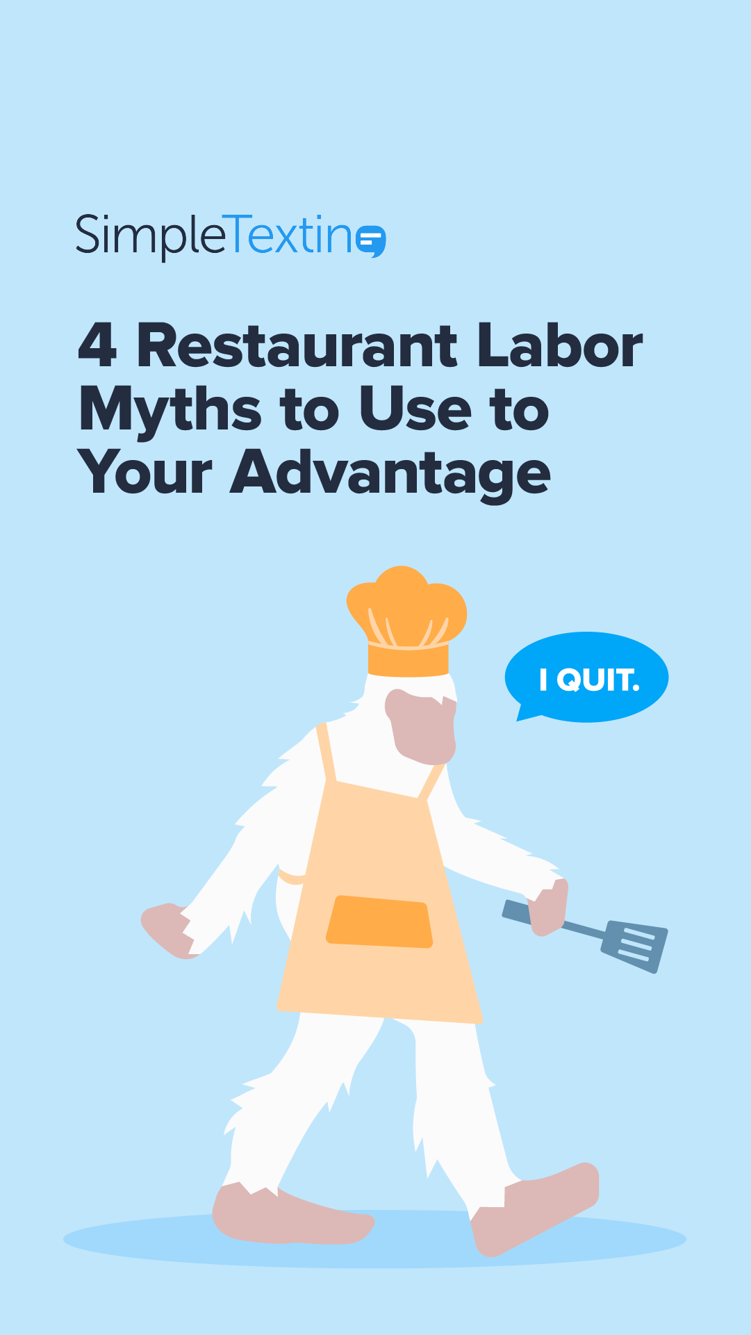
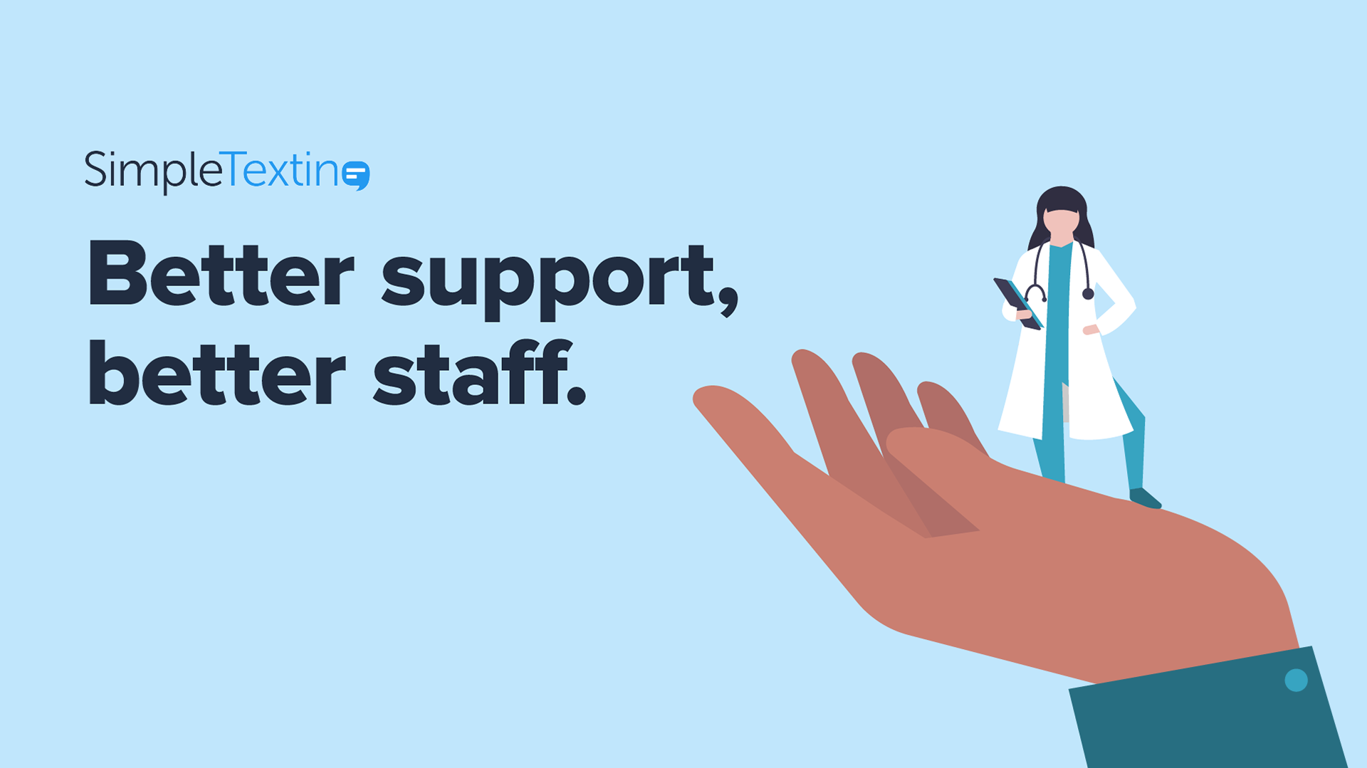
This specific set of ads was for a top of funnel campaign targeted toward healthcare and restaurant industries. We tested two visual styles per ad. Ads were made for Facebook, LinkedIn, Reddit, and Taboola. Below are the ones that ran on Facebook.
This specific set of ads was for a top of funnel campaign targeted toward healthcare and restaurant industries. We tested two visual styles per ad. Ads were made for Facebook, LinkedIn, Reddit, and Taboola. Below are the ones that ran on Facebook.



















Motion
These were video ads that continued the healthcare and restaurant industries campaign mentioned above. The video was recorded and handed off to me to finalize in any way I saw fit. This included all of the motion graphics/animations and where they would show up, the addition of music, and the addition of the logo intro and outro.
These were video ads that continued the healthcare and restaurant industries campaign mentioned above. The video was recorded and handed off to me to finalize in any way I saw fit. This included all of the motion graphics/animations and where they would show up, the addition of music, and the addition of the logo intro and outro.
Web
The website was lacking a page that neatly summed up key reasons a potential customer should choose SimpleTexting over a competing company. These reasons were spread around the website and were often text-heavy. I created the "Why SimpleTexting" page to house bite-sized pieces of info that flow into one another, show the human side of the company, and to act as a visually engaging highlight on the site. Below is a static mockup of the page, as it had yet to go live during my time there.
The website was lacking a page that neatly summed up key reasons a potential customer should choose SimpleTexting over a competing company. These reasons were spread around the website and were often text-heavy. I created the "Why SimpleTexting" page to house bite-sized pieces of info that flow into one another, show the human side of the company, and to act as a visually engaging highlight on the site. Below is a static mockup of the page, as it had yet to go live during my time there.
